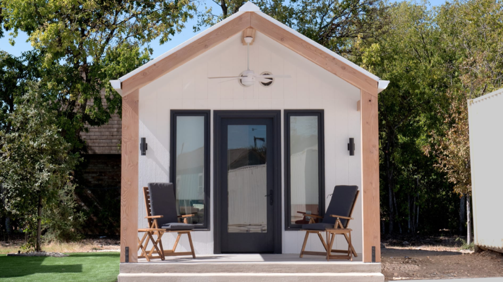
The company used trauma-informed design to create a comfortable, welcoming space for formerly homeless seniors in San Antonio.
Adele Peters • October 2024
A few years ago, as a team at Ikea U.S. thought about how it could help tackle the challenges of unaffordable housing and homelessness, they decided to try something new.
“We really wanted to challenge ourselves on how we could move away from the typical onetime donations that businesses or retailers usually do, and really try to work with communities in a more strategic way,” says Samantha Eisenman, sustainability business partner at Ikea U.S.
They started a new pilot project: how to design a tiny house for a permanent supportive housing community in San Antonio. Working with local architecture firm WestEast Design Group, they used trauma-informed design principles to make a space that felt as safe as possible for someone who has experienced homelessness.
It’s a step further than typical housing of this kind. “Often, it’s what can be built fastest, cheapest, and easiest,” Eisenman says. “It doesn’t necessarily take into consideration the person who’s going to be living in it and what they may have experienced, and how to build that environment in a way that supports them on their journey and in their well-being.”
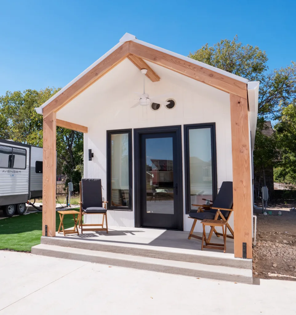
The team met with some of the residents of the new community, a neighborhood under construction that will eventually include around 200 tiny houses, RVs, and apartments on the site of a former drive-in movie theater. The neighborhood is designed for seniors who have been homeless for at least a year, have disabilities such as chronic illnesses, and who have typically been living in encampments.
So far, around 70 residents have moved into the community, and another 60 will move in over the next two months. (In addition to housing, the community includes on-site counseling, health clinics, meals and a food pantry, recreation space, and other services.) Ikea’s donated 365-square-foot home, which was completed this week, is only a single house in the community—but the company is hoping it can inspire similar work.
Residents shared what they’d look for in a home, and the team started working on the design. Their prototype of a one-bedroom home sat in an Ikea store so that residents could visit in person and give more feedback. A key theme was making the home feel safe, something that went beyond having secure windows and doors. “What someone who has been housed their entire life feels is safe, it turns out, isn’t necessarily the same for someone who hasn’t always had a door to lock or windows to close,” says Susannah Munson, an interior designer at Ikea.
It was important to have clear sight lines. If someone is relaxing in their living room, for example, they want to be able to see if someone is approaching their home. At the same time, they don’t want to feel exposed. The original design called for large windows to bring in as much light as possible, but residents wanted more privacy. In the final design, the windows are smaller—tall but narrow—with multiple layers of curtains so residents can choose how much they want to screen the view.
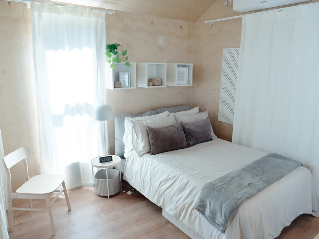
Inside the bedroom, layers of drapery give an adjustable level of privacy from the living room. (Other than the bathroom, which has a door, the home uses curtains to separate spaces visually.) “You can essentially add layers of cocooning around yourself as you get closer to the back part of the house, which is where the bedroom portion is located,” Munson says. “You can add to that sort of feeling of being protected and a little bit of privacy, but also just as important was that was how you could transform the space over time as you potentially become more comfortable seeing a little more of what’s around you, maybe allowing others to see a little bit more of your life. So you can really conceal or reveal as it suits your comfort at any given time.”
Giving residents a sense of control is another principle of trauma-informed design. While tiny houses or RVs often include built-in furniture to maximize the use of space, “that doesn’t allow for that element of choice and sort of self-determination,” Munson explains. “So we actually took the approach of making the layout as flexible as possible.” The furniture is lightweight and easy to move around, but durable. The living room can be arranged for relaxing, with an armchair in front of the TV, or entertaining, with an extendable dinner table that can fit six people.
The bathroom has a tub, something that was a request from residents. “For a lot of these folks who have experienced homelessness, most of the time what they are able to access is maybe a stall shower at a shelter or day center,” Eisenman says. “It’s something that they have to be quick about, not necessarily feel that sense of safety or luxury. For them to say, ‘I want a bathtub in my home where I can sit and I can relax and I can feel the sense of calm and peace,’ was powerful for us. So the home has a bathtub in it—we made sure that was on our must-have list.”
The model home was designed to be as affordable as possible. “From the very beginning, we basically challenged ourselves to say we have to do it with a better result for less money,” Eisenman says. The first home, inevitably, had extra expenses as the team built it for the first time. But they believe that trauma-informed design can be done affordably. The designers also used the same principles to decorate a few other tiny homes in the San Antonio community that hadn’t been custom-designed.
Housing First Community Coalition, the organization that runs the supportive housing community, plans to evaluate the home—and the other houses on-site that Ikea furnished—over the next several months. “Folks aren’t shy about telling us what works and what doesn’t work,” says Edward Gonzales, the nonprofit’s executive director. “So we anticipate getting direct feedback very quickly.” The organization will also monitor the home as the team does maintenance.
The community was already designed to cater to seniors with disabilities, but Ikea’s work on the interiors “is definitely an enhancement to what we’ve done,” Gonzales says. If the team gets positive feedback, the same ideas (and potentially Ikea furniture) could be added to future homes that are still under construction. When RVs on-site need to be replaced years in the future, the design for the custom tiny house could also be replicated.
Ikea plans to offer training in trauma-informed design to workers across the country so that the principles can be used in other projects. In Washington, D.C., a team is already working with a new affordable housing development to help incorporate trauma-informed design principles. The goal is to make this type of design more widespread. “We want to get more awareness of it,” Eisenman says. “And hopefully with that, we can get the right stakeholders involved and really start to make it more mainstream and more standard.”
Resource: https://www.fastcompany.com/91218065/inside-ikeas-thoughtfully-designed-tiny-house
