

By Ehsan Moradi
This article looks at how the fundamental differences between Persian-Arabic and Latin scripts affect the way designers create bilingual logotypes.Unlike standard text layouts, bilingual logo design requires careful consideration of letter structure, balance, and direction. It becomes especially relevant when a designer is working across different writing systems and needs to create a unified visual identity.
The Persian-Arabic script, often called the “Eastern Script,” developed during the early Islamic centuries. It is characterized by connected, dynamic letterforms. In contrast, the Latin script, originating from ancient Rome, features discrete, standalone letters. These fundamental differences have profound impacts on typography and logotype design.
In Persian-Arabic typography, letters are typically connected and can change shape depending on their position in the word—initial, medial, final, or isolated. This fluid structure makes typography more complex and demands a deep understanding of the calligraphic nature of the script. On the other hand, Latin letters remain largely consistent regardless of position, making their typographic treatment more straightforward.
Designing bilingual logotypes, combining Persian-Arabic and Latin scripts, requires addressing several technical aspects:
Classical Style with Stroke Contrast:
When creating a more traditional and prestigious look, pairing serif fonts (Latin) with Persian-Arabic calligraphic styles that have strong stroke contrast (such as Naskh or Nastaliq) works effectively. The variable line thickness gives both scripts a compatible, elegant rhythm.
Modern Monoline Style:
For minimalist and contemporary aesthetics, sans-serif fonts (Latin) align well with Persian-Arabic fonts designed with monoline structures (such as Yekan or Vazir). Here, the even stroke width across letters provides a harmonious, clean bilingual composition.
x-height and Vertical Metrics:
Ensuring that the x-height of Latin letters visually aligns with the midline or “Kashida” flow of Persian-Arabic words maintains visual balance between the scripts.
Stroke Weight Consistency:
Matching the overall thickness of letter strokes across both scripts is crucial for cohesive appearance.
Kerning and Spacing:
Careful adjustment of letter spacing is essential, respecting the different rhythm and density of Persian-Arabic and Latin typography.
Right-to-Left and Left-to-Right:
Persian-Arabic flows right-to-left, while Latin flows left-to-right. Special attention is needed to avoid visual conflict. Solutions include stacking the scripts vertically, using mirrored layouts, or subtle separators to maintain natural readability.
Balanced Composition:
Visually integrating both scripts into a unified mark without either overpowering the other requires meticulous attention to hierarchy, weight, and negative space.
The deep structural differences between Persian-Arabic and Latin scripts create both challenges and opportunities in bilingual logotype design. By carefully considering typographic style, structural harmony, and layout strategies, designers can create logotypes that are both visually balanced and culturally respectful.
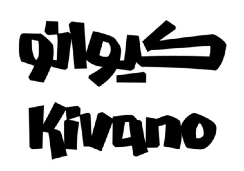
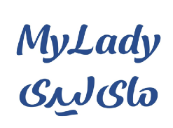
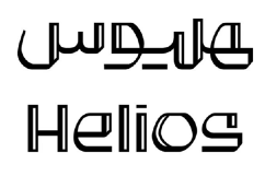
Examples designed by Reza Bakhtiary Fard
About Ehsan Moradi
Ehsan Moradi is an Art Director and Brand Designer, at Maat Agency, with a passion for merging creativity and strategy. Ehsan’s focus is on visual storytelling and creating meaningful connections between brands and their audience.